UX Case Study · Concept
Aldi InStore Shopping App
A concept app that makes in person grocery shopping faster and calmer. Designed for the shoppers who’d rather stay out of online delivery.
01 — Overview
Most grocery tech pushes people online. Some don’t want to go.
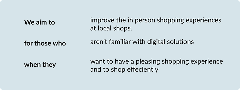
Most grocery innovation aims at delivery and online carts. But a sizeable group still prefers shopping in person and feels left behind by systems that assume everyone wants to move online. Aldi is a concept app for them: it keeps the in store trip and removes the friction around it.
We used these user pain points as our insights to develop the design goal
02 — Research
Listening before designing.
To what extent can digitalizing the in person grocery shopping experience improve customer behavior and satisfaction? In this short project we used Aldi shoppers as the main target audience. for a starting bases, I asked customers shopping if they like shopping in person or digitally and why.
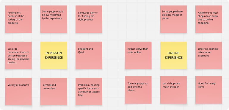
Three attitudes surfaced again and again: people found local stores easy and convenient, they were skeptical of online systems, and many carried a bias that delivery simply costs more.

03 — Persona
Meet Flora.
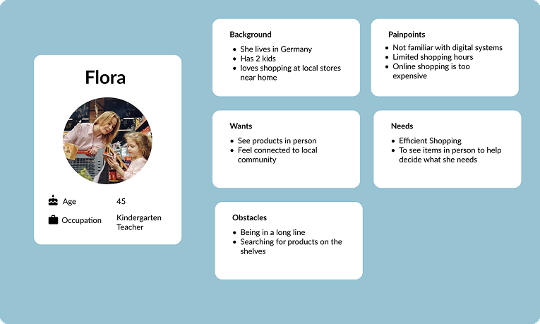
Those attitudes converged on one person. Flora is 45, a kindergarten teacher in Germany with two kids. She loves shopping at the local store but isn’t comfortable with digital systems and she’s worn down by long lines and hunting for products on the shelves.
04 — The current trip
Where a calm errand turns stressful.
Mapping Flora’s current trip showed exactly where things go wrong. She starts calm and happy, then loses time searching for products with no help in sight, and ends drained at a long checkout.
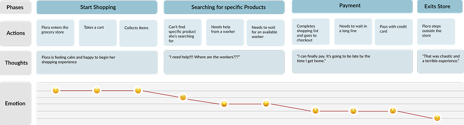
I need help!!! Where are the workers?
05 — Design goals
Turn each pain point into a feature.
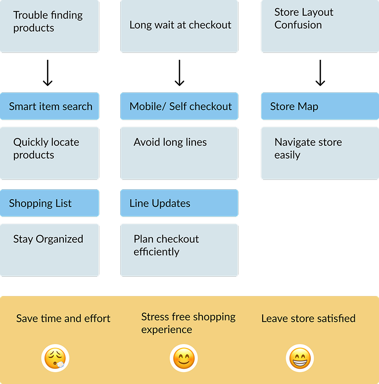
Trouble finding products became a smart item search with a shopping list. Long waits at checkout became mobile / self-checkout with live line updates. Store-layout confusion became an in-store map. All of it pointed at the same outcome: save time, shop stress free, and leave the store satisfied.
06 — The concept
Keep Flora in the aisles; handle the rest.
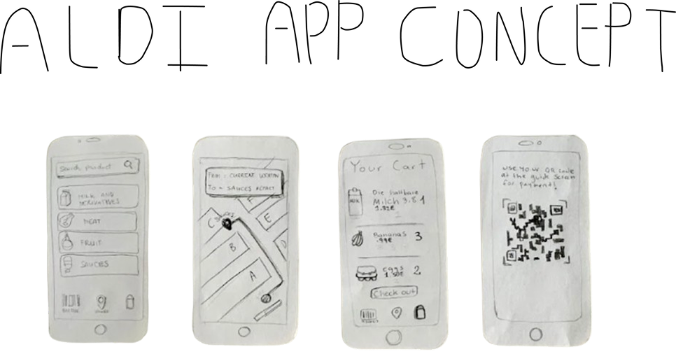
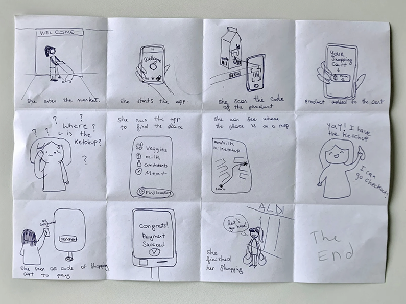
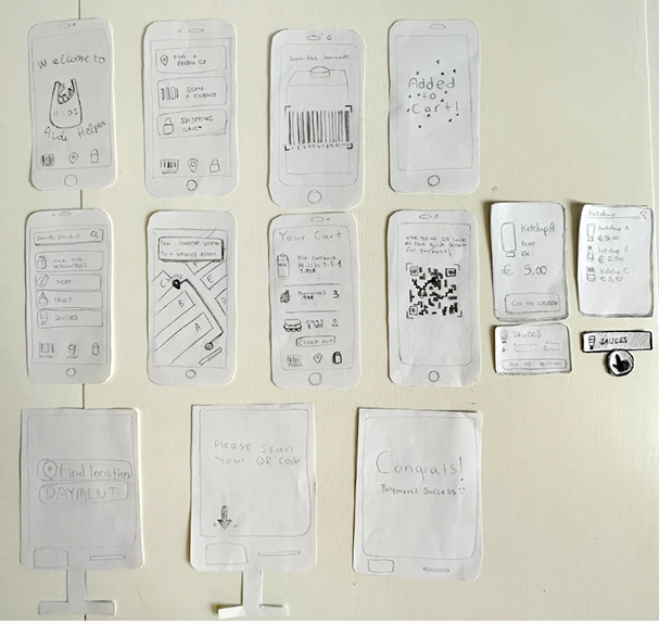
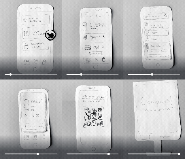
I sketched the flow as a storyboard, then built a paper prototype: find a product, scan as you go, follow the store map, and check out with a QR code at self checkout.
07 — Reflection
Possibly a solution towards international students
Although we kept a user similar to Flora in mind, the project turned out to be most likely more useful for foreign students. It could be a good solution for adding accurate product translations and offering different languages. It could be a way to help a foreigner become more comfortable with shopping until they familiarize themselves. The solution we made wasn’t so different from self checkout, but it enhances the self checkout concept.